You designed a poster in bright, electric blue on your laptop screen. It looked stunning. But when the printed banner arrived, the blue looked flat, slightly greyish, and nothing like what you saw on screen. If this has happened to you, you're not alone — it's one of the most common frustrations we hear from customers across Johor. The culprit almost always comes down to one thing: colour mode. Understanding the difference between RGB and CMYK can save you from disappointing reprints, wasted materials, and awkward conversations with clients waiting on their marketing materials.
What Is RGB?
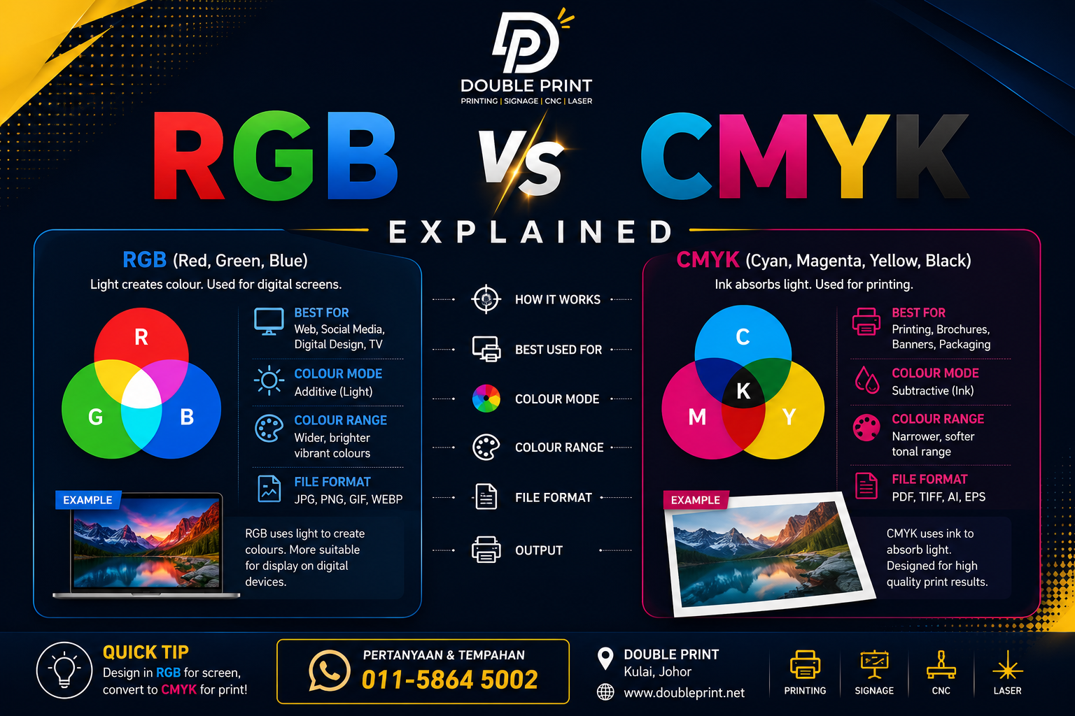
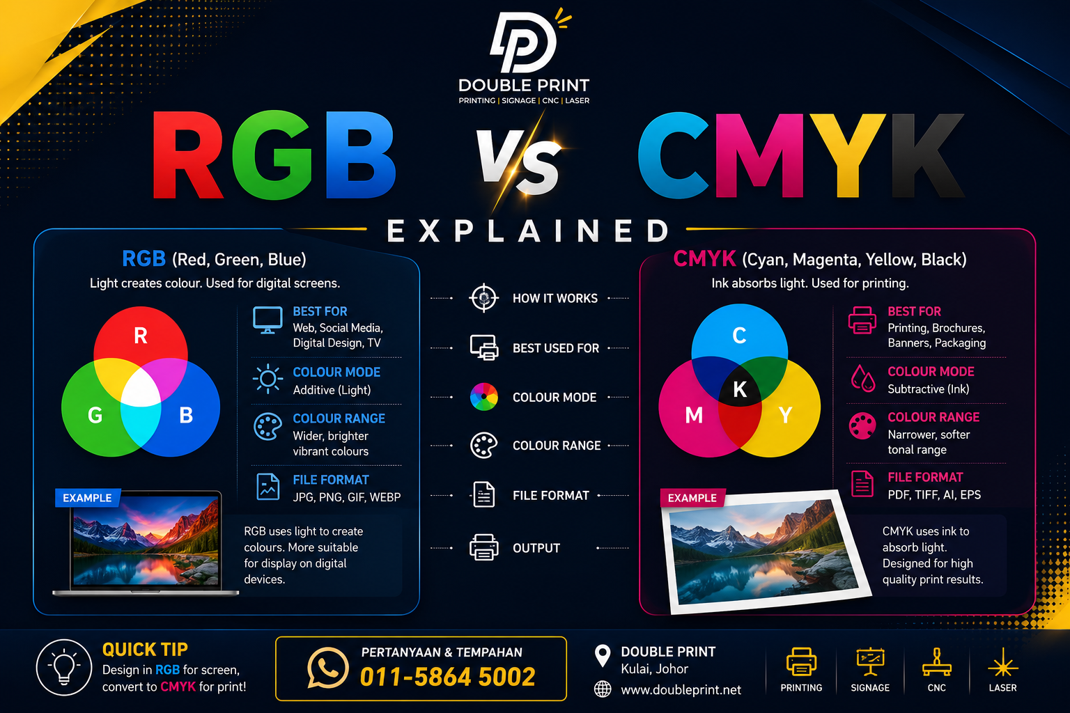
RGB stands for Red, Green, and Blue. It's a colour system built for screens — phones, laptops, TVs, and cameras. RGB works by combining light: when all three colours are at full intensity, you get pure white light. This is called an additive colour model because it adds light to create colour.
Because RGB is generated by light, it can produce an enormous range of vibrant, glowing colours — neon greens, electric blues, deep purples — that are simply impossible to recreate with ink on paper. This is why your screen always looks more
Notes from the press floor at Double Print, Kulai. We print, cut, engrave and craft for businesses across Johor and beyond. Send us a brief.